In this article
Color grading from movies to photos
The topic of color in photography always fascinated me. Looking at different fashion and portrait images, at evening cityscapes, colors often looked so nice and tasty. After some investigation I have learned that the technique that let's you explore color in photography is called Color Grading and comes from the movies production.
Color grading in movies
In movies, color grading serves a similar purpose to what we, photographers, do in RAW converter. Original footage usually looks very flat and with color grading it's possible to bring back color, contrast and punch. Additionally, colors can be used to give mood and atmosphere to the picture.
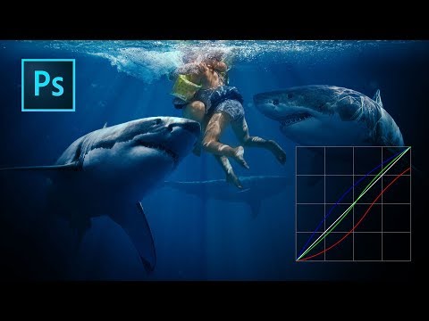
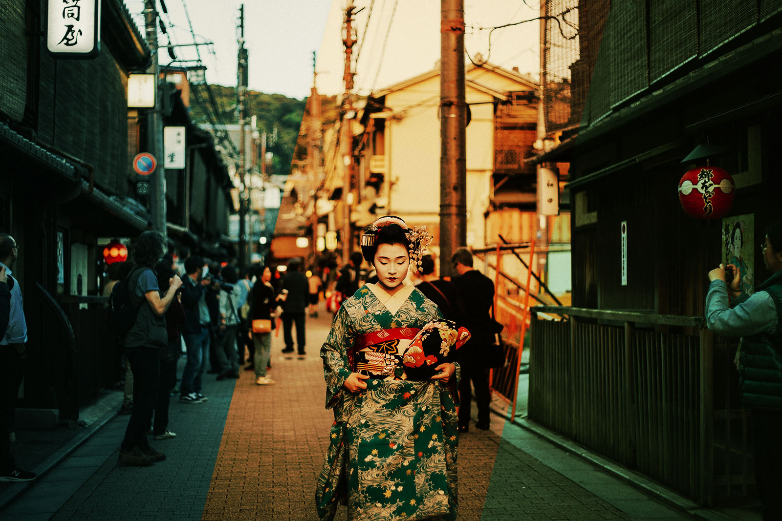
Take a look at these different grades from movies.
Matrix has a distinct green color, with highlights being a bit warm. This hints to the viewer that he is in the "Matrix".

Mad Max color pallet is mostly red and yellow. Even the sky that is usually blue is more yellowish-blue in the movie. This helps viewer get into the heat of the desert, as if there is sand everywhere.
/cdn.vox-cdn.com/uploads/chorus_asset/file/3697640/fury-road-image-1.0.jpg)
Classical Aliens (and many many other movies) are Teal/Orange, moving skin tones to the warmer color and backgrounds to cooler tones, bringing depth and focus on the actors. You can notice that even the color of the lamps in the background is of a cool tone.

Footage for clips, movies and lately even YouTube videos rarely released without color grading.
How is it done in movies
In movie production, there are many professional tools that allow to correct and tweak colors. Among free tools the most popular is Davinci Resolve, but almost any video editing software allows to manipulate color.
Using Resolve as example, you are given 4 color wheels that let you control color adjustments in lights, midtones and darks separately. Additionally, there is Offset, that shifts tone of the whole image. There are some extra tools like curves and levels that we all know, and some movie-specific image analysis utilities.

It is very visual and easy to adjust.
The resulting color grade can usually be exported as a Look Up Table (LUT) - a table describing which colors should be applied to raw footage to make it look like you want.
What about photographs?
I was sure that if color grading was already there for video footage, there would be an equally simple to use tool for Photoshop. Unfortunately, that's not the case.
You can purchase online and apply pre-made LUTs to your picture, but results aren't always great because original image is never the same and LUTs aren't really configurable afterward - you just get what you get.
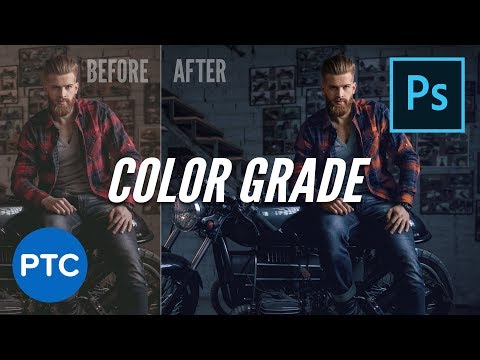
There are many ways to achieve same or similar result in Photoshop. Professional color correctors use a wide variety of tools. Here are just a few examples.
With Curves
If you create a Curve adjustment layer, you can change colors be adjusting Red, Green and Blue curves respectively. Form of the curve will also control where the effect should be applied on luminosity spectrum.
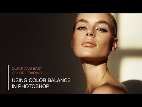
With Color Balance
Color balance adjustment layer allows to shift color hue independently in highlights, midtones and shadows. Sounds like a great candidate for color grading.
With Selective Color
Selective color adjustment layer lets you modify existing color of the image. You can make such adjustments that, for example, light from the lamps would be colder, but then usually you either have a global adjustment or would need to carefully mask it in.
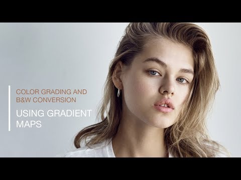
With Gradient Maps
Gradient Maps are mostly used now for skin-tone adjustments, but they could also be used to grade the image, by using Gradient Maps with color and different blending modes.
There are also some options for color correction and grading built into Lightroom.
Sadly, all of the listed tools have one big flaw - you can't quickly tell which color is set where. It's not as visual as in Davinci Resolve.
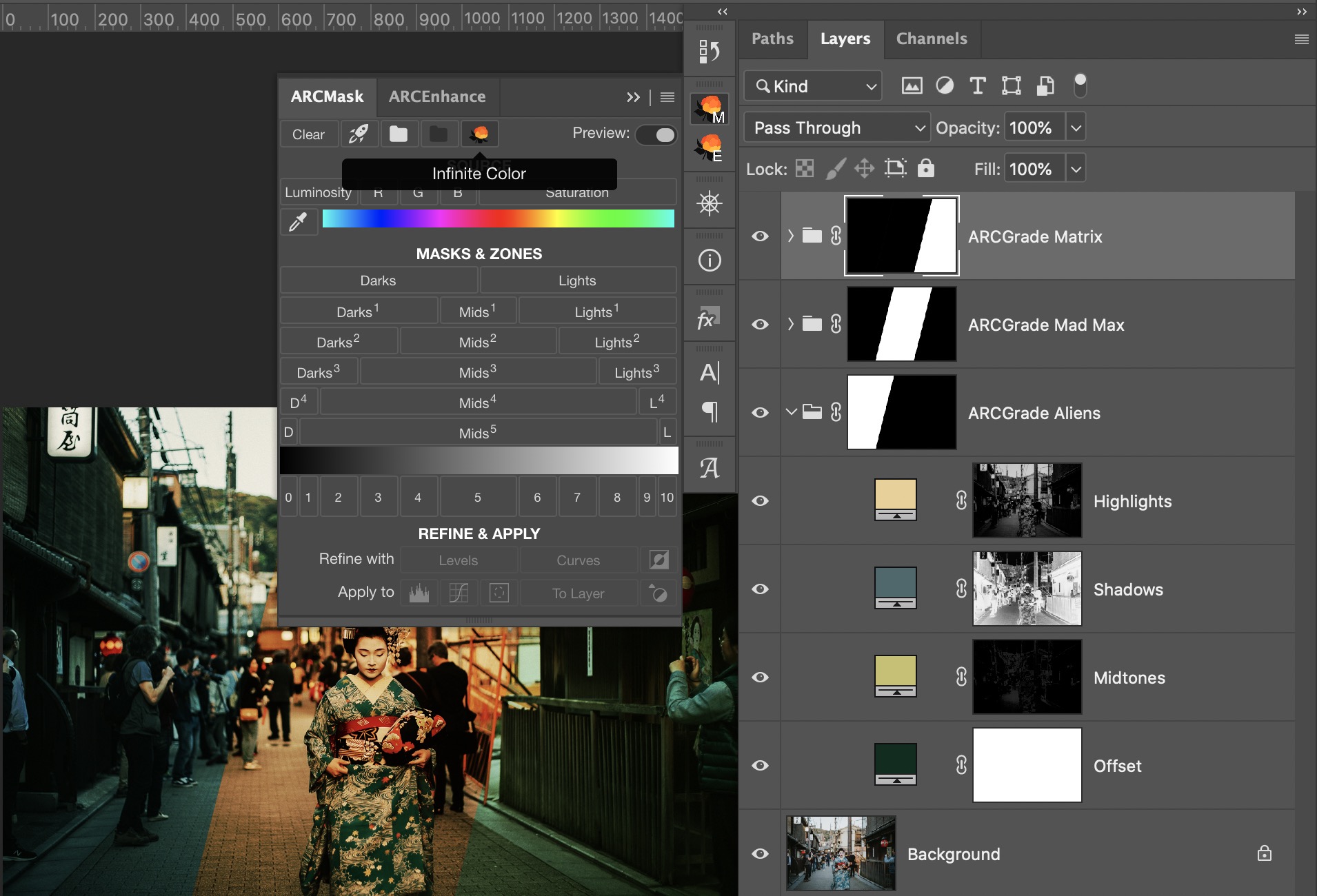
There is one other instrument that we didn't explore - Solid Color. It lets you pick the color and it's very visual. With a combination of blending modes and a secret ingredient Solid Color becomes a great option for Color Grading. And the secret ingredient are Luminosity Masks.
Color grading with luminosity masks
Luminosity masking sounds like a perfect tool to help with color grading. They allow to limit desired effect to Lights, Midtones or Darks, and that effect could be a change of color.
In this article I have already explored how to simulate Davinci Resolve tools in Adobe Photoshop. You can refer to that article to see exact steps how to manually create grading layers and limit them with luminosity masks.
Now that Color Grading is built into ARCPanel we can also experiment with Color Grading in photographs much faster.
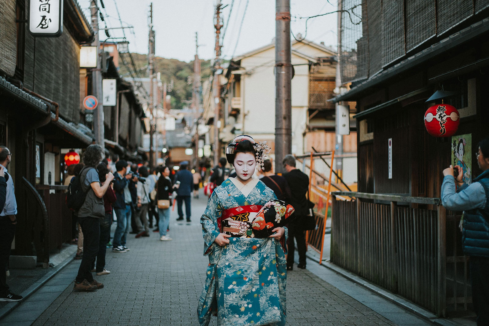
Here is what I was able to achieve in just a few minutes.
How it works
Here is how it works.
If you prefer to build luminosity masks by hand or use any other tool, you can follow my example from this article. If you use ARCPanel, you can generate random grading with just one press of the button.
On the base image, I have applied following settings:
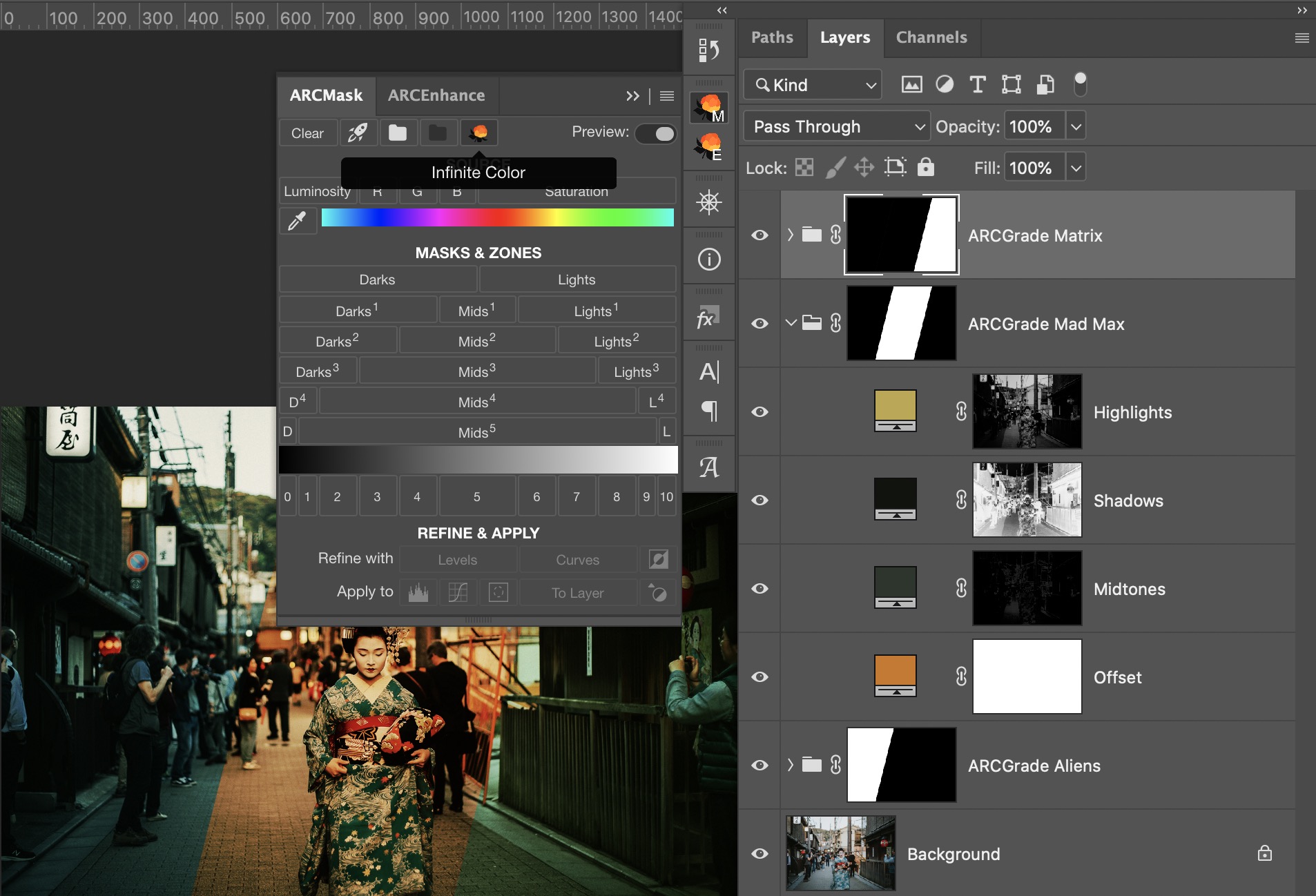
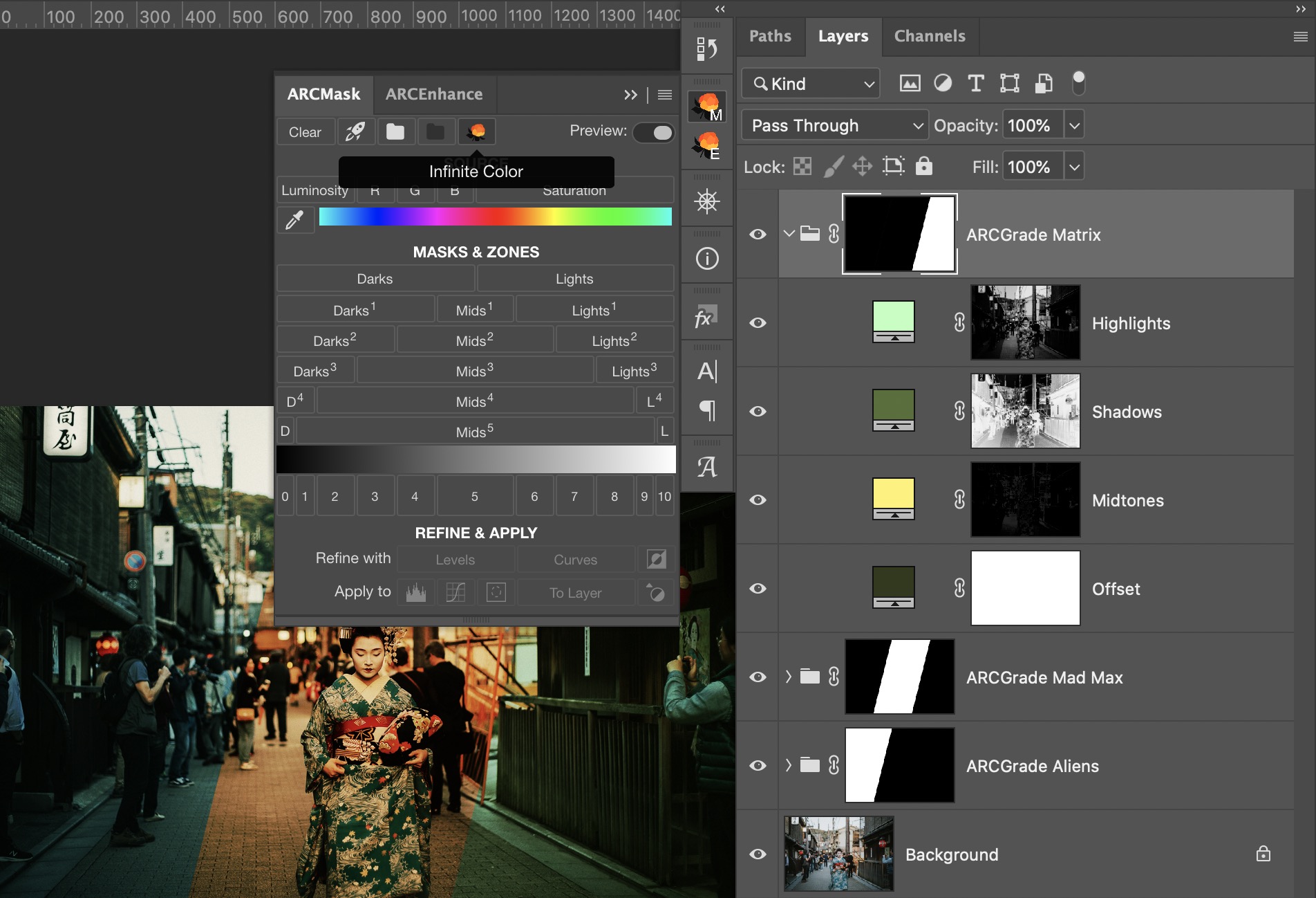
Here are the exact color values
Matrix: Offset 31391b, Lights baffbd, Mids fff36c, Darks 556f36
Mad Max: Offset cf761b, Lights bea648, Mids 2c352d, Darks 11130e
Aliens: Offset 072d1f, Lights eccf92, Mids c6c16a, Darks 4a686c
Applying same values to your image will give you close, but not exactly the same results. That is because base colors and brightness of your image is different.
How to pick grade colors
As you have probably guessed, grade colors are not picked at random.
If you are building grades by hand, look into some color theory and try to pick colors that complement each other in some way. Some schemes that usually give good results are Triade, Tetrade and Analogic with complimentary color.
For example, Mad Max grading is more analogic with reds dominating the scene while complimentary color is a deep green that can be seen in shadows. Teal/Orange is a classic contrast scheme that can be expanded as a Triade for more color spread.
For ARCPanel users, picking the best colors is already built in. When you press on the
Infinite Color button on the panel, it picks a random base color and builds a good looking combination of colors for you.Summary
Color grading is a great tool that helps convey mood in the image. While there are many ways to grade in Photoshop, Selective Color with Luminosity Masks looks like the most visual and easy to use tool.
If you know what mood do you want exactly in your work, you can use one of the described methods.
But if you are not yet sure, you can use ARCPanel new functionality to explore different color options. Generated with one click, pick the one you like and do necessary adjustments.
Preparing login widget...